Graphics and Sprites
I’m using spritesheets from The Spriter’s Resource as a reference. Unless otherwise noted, I’ll be using the term base sprite size for the size of main character’s idle standing pose, when looking down; most games allow for bigger sprites than the base one, but they usually don’t stray too far from it.
Platform and screen resolutions are noted next to the game’s name. Most of these games have a 3/4 perspective. Collisions are usually restricted to varying proportions of the lower section of the character’s body. Usually, taller character sprites result in an increased perspective, as more of the sprite overlaps with other objects without colliding with them.
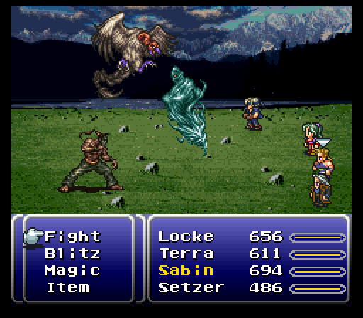
Final Fantasy VI (SNES, 256x224px)
Characters
The game is quite resourceful in their sprite usage: the same character sprites are used for the local, world and battle scenes. They base size is 16x24px in size. Character movement is strictly 4 directional, and movement cycles have 4 frames.
In addition to this, and possibly due to the smaller sprite size, there are no special animations for running, and many sprites are reused for different purposes (such as having animations with 1 and 2 hands raised being used for things like climbing or throwing a toast). Simple expressive animations, such as laughing, being surprised and frowning, are also included, though they are at most 2 frames in length. There are limitations in character design due to the sprite size: the sprite creator revised the original concept for player character Terra Branford, giving her green hair to make her stand out among other characters.
Environment
FFVI uses 16x16px tiles. The local environment is quite detailed, giving room for a lot of worldbuilding and immersion. Even though most towns look the same architecturally, many details such as tables, chairs, stoves, armor sets and other things can be seen inside houses. Combat takes place in a separate scene, with a style that usually follows the enemy sprites’ detailed style, with some exceptions.
Special Note: Enemies
Enemies have larger sprites, but only in battle; additionally, these larger sprites are completely static (though their attacks involve some sort of animation, the sprite remains the same). Curiously, these enemy sprites also have a more realistic and detailed style, in contrast to the cartoony character sprites. This can be a bit weird when fighting human enemies!
Pokémon (GB, 160x144; GBA, 240x160; NDS, 256x192)
I will comment only on the first five generations of Pokémon games, as they transitioned to full 3D afterwards.
Characters
The player characters aren’t very detailed, as their style tends to have a head that’s roughly as big as the body (bigger in the first few games). They have 4-directional movement and 4-frame movement animations. Its size is 16x16px in the first two generations and have no collision-based perspective; 14x21px in the third, 17x24px in the fourth and 22x28px in the fifth. The third generations has some collision-based perspective, while the fourth and fifth’s approaches will be discussed in the next subsection. Some of the titular characters are displayed outside of battle, usually through simplified sprites. During battle, though, these creatures have sprites with a good amount of detail, but very limited animations.

Environment
The world has more or less the same style as the player character for the first three generations; the fourth and fifth generations mix 3D models and sprites, along with camera techniques to allow for different perspectives. These games have no world scene beyond a very simple map sprite.
Crono Trigger
Characters
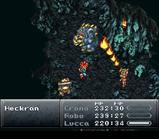
Crono Trigger’s main character has a 15x36px idle sprite, used for both local exploration and combat. However, in contrast to FFVI and Golden Sun (detailed below) this size is larger for some actions and characters. Movement is 4-directional sprite-wise, but 8-directional in regards to controls.
The bigger sprite size allows for more expressive and differentiated actions such as running, emoting, and using weapons and techniques, especially during combat. This, in turn, helps characterization, as each character has distinctive battle animations.
The game also has tiny, roughly 11x17 sprites for world exploration. As to be expected from such small sprites, they have very limited animation. It can be argued that this is appropriate because of the lack of world activities other than traveling: there’s no random encounters or other events outside of cutscenes.
Environment
Similar to FFVI, Chrono Trigger has 16x16tiles and a good degree of detail in its local scene. Chrono trigger overlays characters and enemies over the local exploration scene for its combat. However, Chrono Trigger’s world scene is much more detailed than FFVI’s, making many locations distinctly different from each other, even in this zoomed-out mode.
Golden Sun (GBA, 240x160)
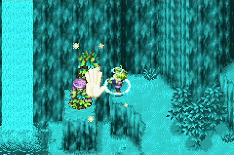
Golden Sun uses 3D-styled sprites for its combat, so I’ll skip those, as I’m aiming for a full 2D game. The Local and World sprites are approximately 18x30px, similar to Chrono Trigger’s in total area. Animations are 8-directional and basic movement cycles have 6 frames. These last two facts heavily increase the amount of work to be done in animations; however, this is alleviated by some design choices. First, character emotions are conveyed by emotes in speech bubbles; second, most complex out-of battle actions are performed via Psynergy: special abilities where the character assumes a casting pose. Finally, most animations keep the sprite size more or less constant.
Environment
Golden Sun follows the same trend as the previously mentioned game: 16x16 tiles. Even though the game has tile-based puzzles, player movement doesn’t seem to be restricted to tiles. The world map seems to be a single sprite that is slightly rotated and distorted to give a feel of perspective.
Radiant Historia (NDS, 256x192)
Characters
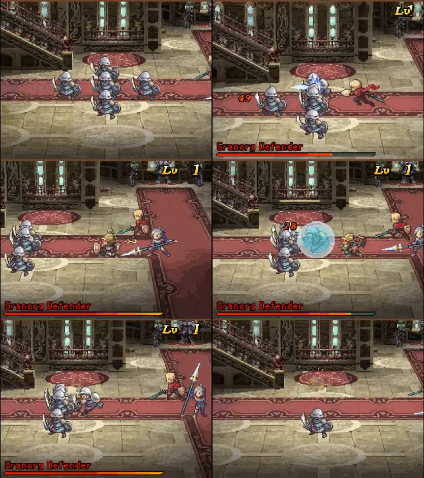
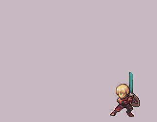
Radiant Historia has bigger sprites than the already mentioned games: they stand at a whopping 22x 33px: that’s twice the surface of a Final Fantasy 6’s character sprite. Movement can have any direction (you can make the character follow the DS stylus) but sprite-wise, there’s only 4 directions. The main character has a small set of actions he can perform in the local exploration mode, mainly a quick swipe with his sword.
In-battle sprites are even bigger: they’re around 40 pixels tall and have various widths depending on the character size and their battle stance. These sprites also have a surprising amount of shading: the main character’s hair has at least 8 shades of yellow. Each character also has their custom animations and attacks.
Environment
The environment seems to mix 3D renders with some 2D and 3D objects and 2D NPCs. There is a world scene, but it’s almost as simple as those from the Pokémon games.
A sort of conclusion
In terms of player character sizes, we roughly have:
FFVI < Golden Sun = Chrono Trigger < Radiant Historia
with Pokémon sprites having varying sizes, but usually toward the lower side of the spectrum. I’m used to editing Chrono Triger sprites, so I’ll be using sprite sizes around their size (currently working on a 17x35px person). I’d really like for my characters to display emotion and various techniques through their sprites, but I think Radiant Historia-sized sprites would destroy me.
About backgrounds, 16x16 sprites seem to be a natural choice, though the amount of work to be done to draw all tiles I’ll need might be a bit overwhelming. I’ll have to see. Luckily, I don’t have to make most objects tile-based, as was the case with older games. A world scene is still not in the plans.
Also, some further reading for making pixel art:
That’s it!
